ABOVE THE BELT: ZUMIEZ is a Rebrand project served to take an already established corporation and maximize its reach and service. Specifically designed to change the perspective of parents of the current teenage consumer. By partnering with two separate nonprofit organizations, Above the Belt Zumiez has the chance to sell ecofriendly surfing products, sponsor every Action Sport they host, and clean up the world!
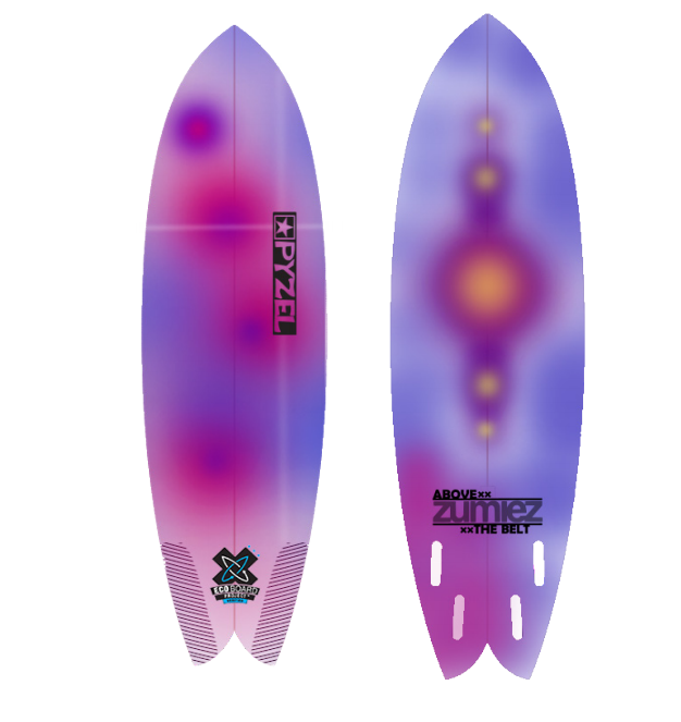
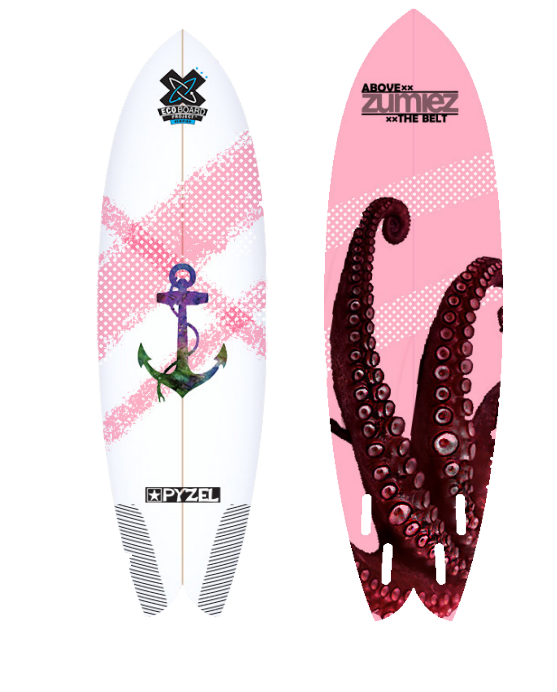
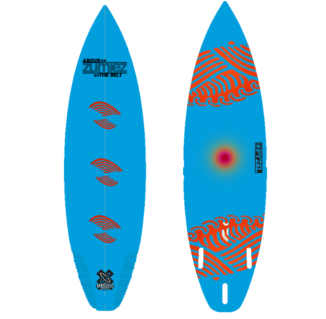
Each surfboard made through ABT: Zumiez is designed to be 30-60% less toxic that the average manufactured board. these mockups represent some of the designs that would be incorporated into the launch sale.
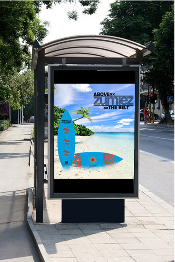

These Represent some of the mockups for product and event advertisements.
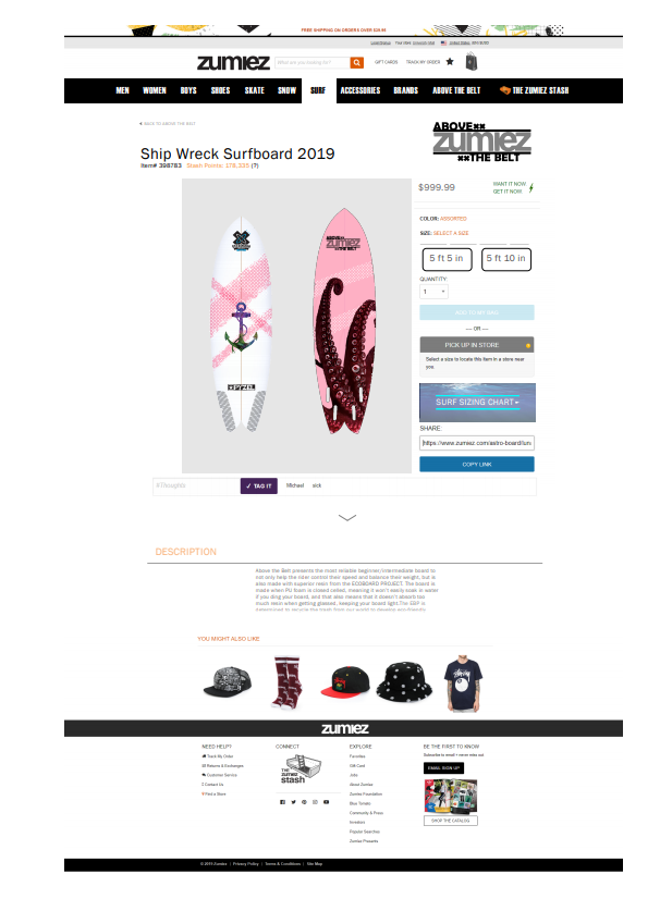
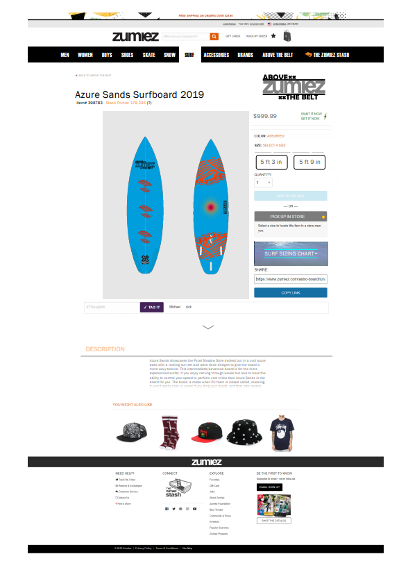
This is a recreation of the zumiez site built to showcase the online sale of an ABOVE the belt: Zumiez Eco-Surfboard. Contained here are the ideas for the SHIPWRECK and Azure Sands Designs.
WELCOME TO KUISINE! A rebrand project that takes a "hello Fresh" style service and reformats its packaging and overall aesthetic to emphasize certain elements of the original intention. KUISINE Takes the company Doo-Food and evolves the experience by enforcing the owner's want to share healthy and easy-make and storage meals. I decided to challenge myself by utilizing culturally based food foreign to the majority of the western world.
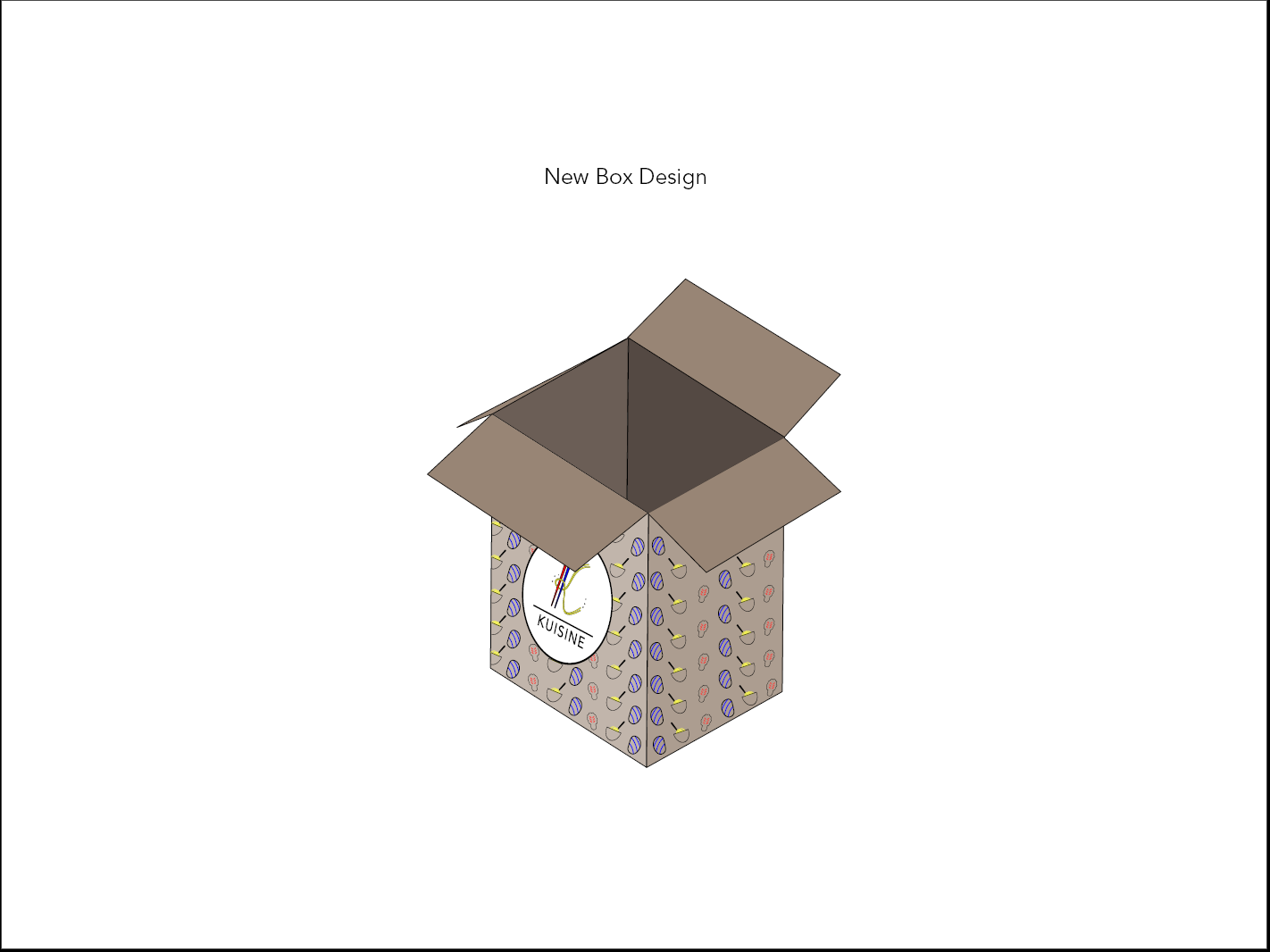
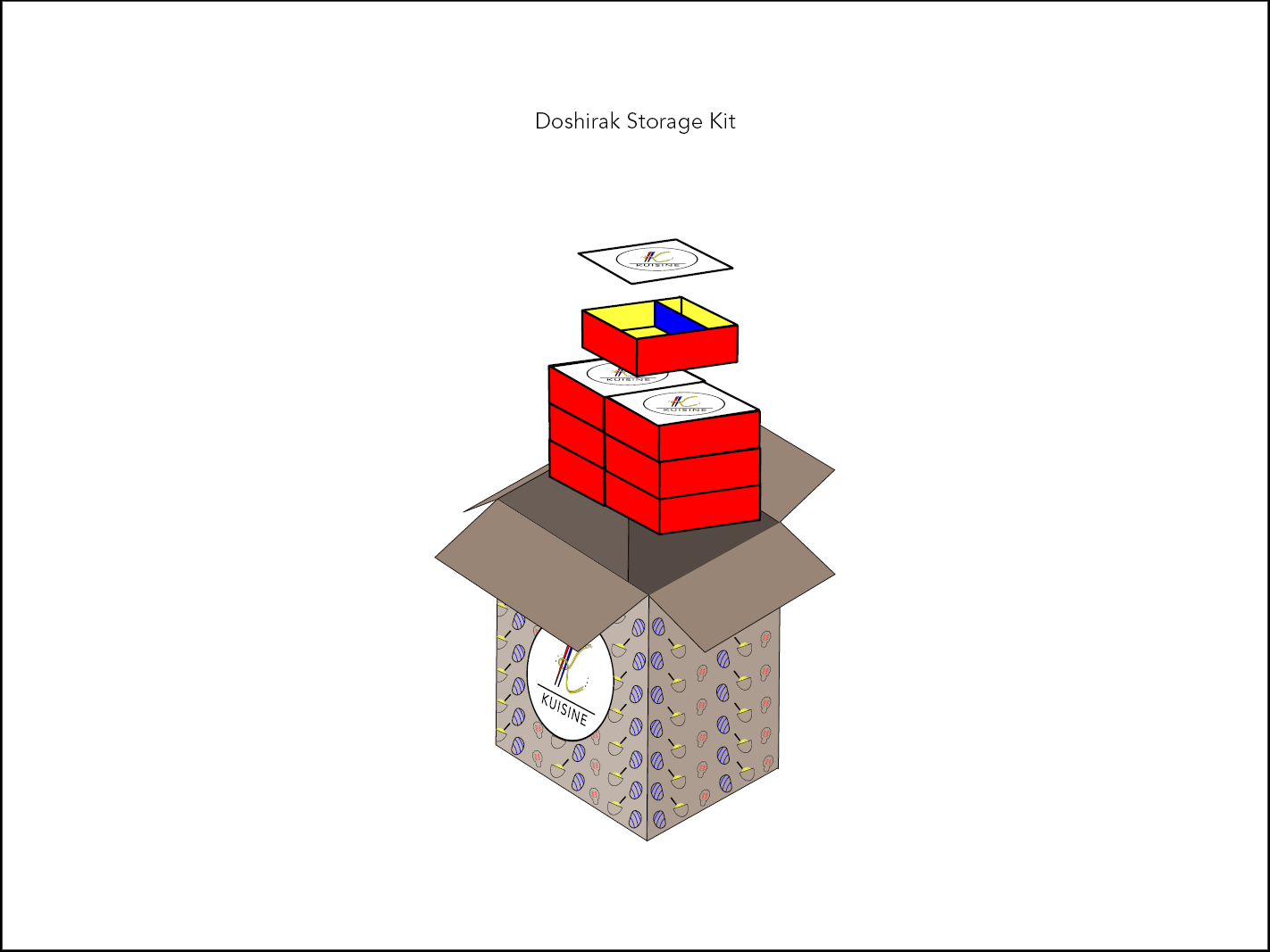
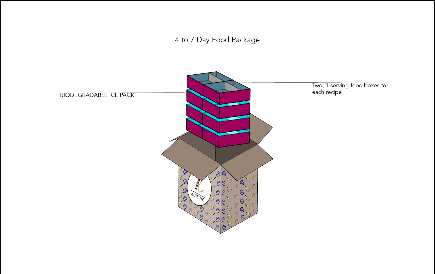
These mockups represent the new package design developed for the brand. By connecting the culture of the food back to the overall brand aesthetic, allows the consumer a full impact experience from delivery to consumption. The main colors focused on are KOrea's OBANgSAEK.
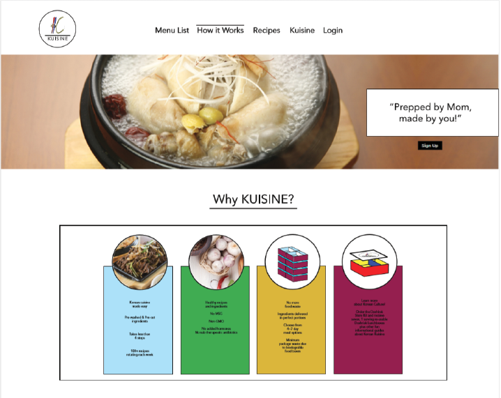
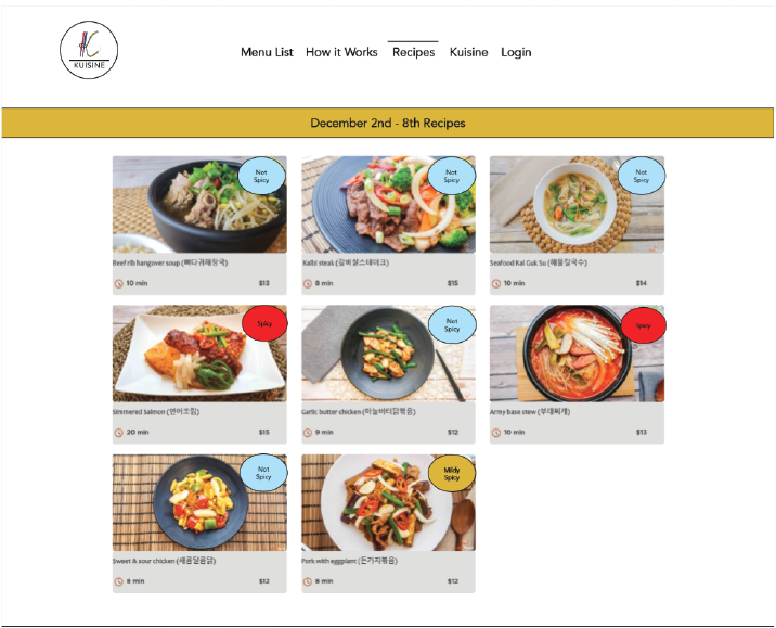

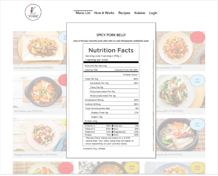
These are mockups for the new website containing the updated color palette and packaging.
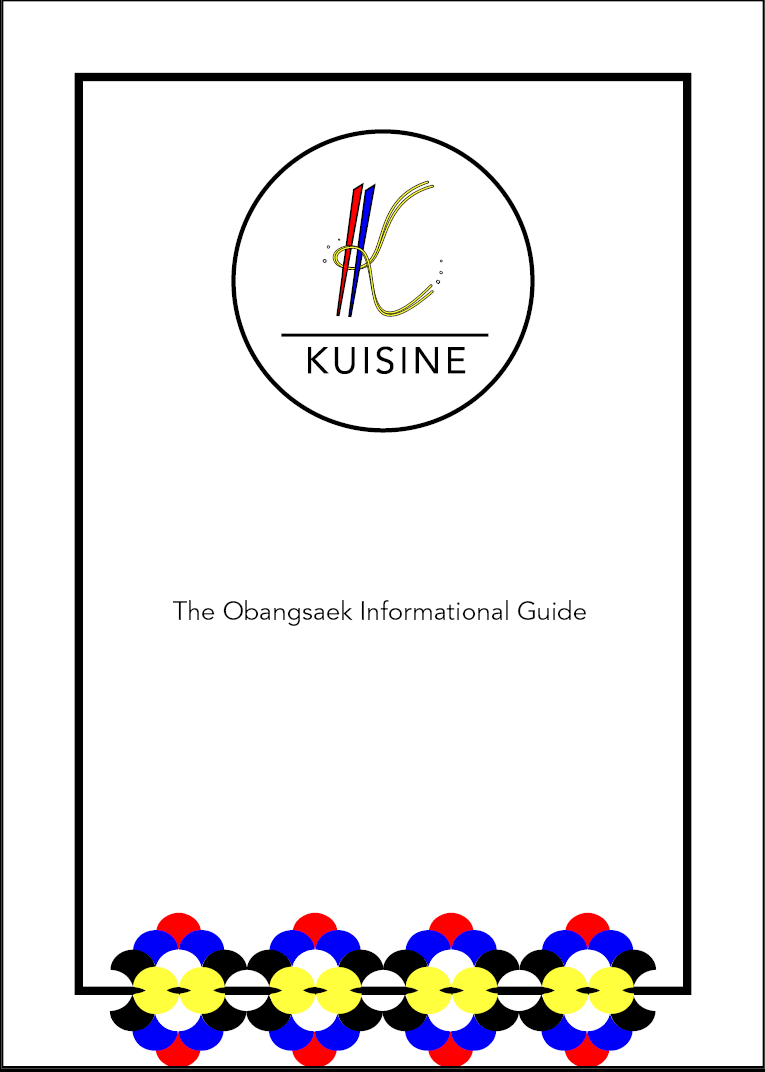
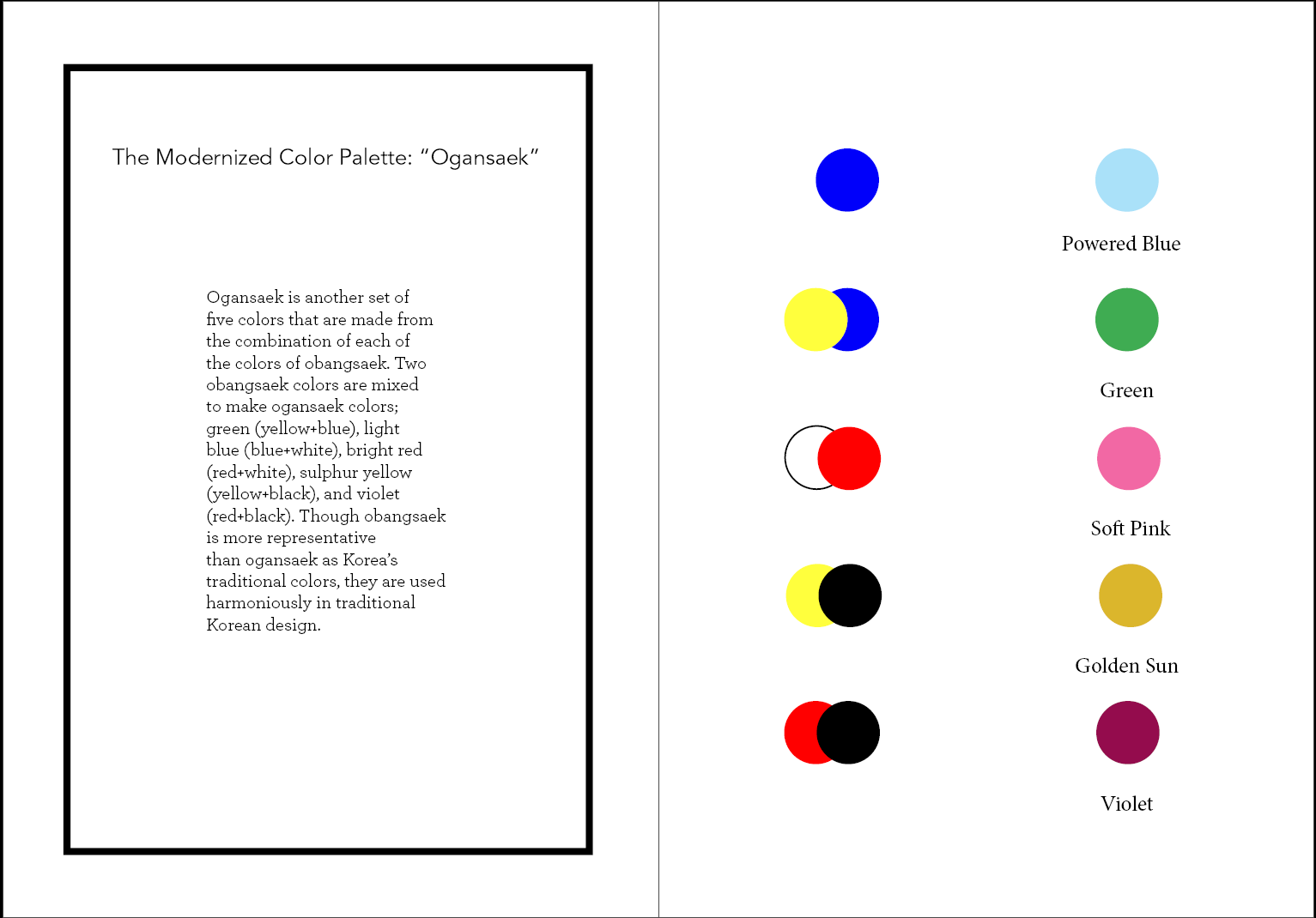
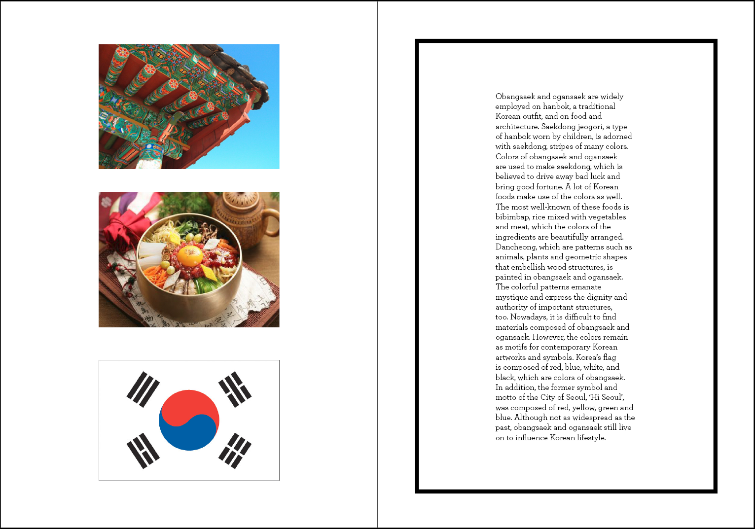
Marketing Artifact contained with every purchase of the Doshirak Storage Kit. Connects the consumer towards the obangsaek and how it has been applied to Korea's food and culture.
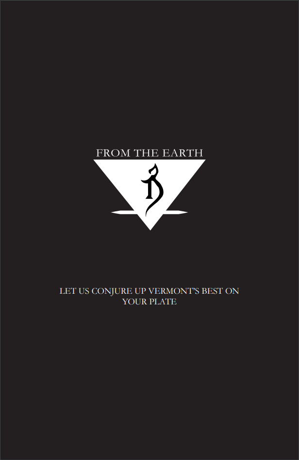
Vermont's finest alchemical food establishment. "From the earth", Restaurant and brewery is a rebrand project devised to take the state-based brewery titled "the Alchemist" and combining them with the state's favorite service: farm to table establishments.
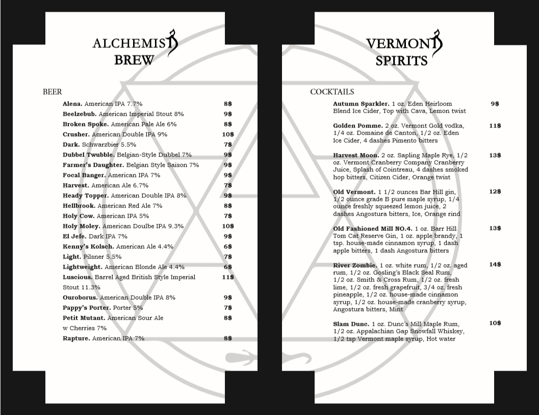
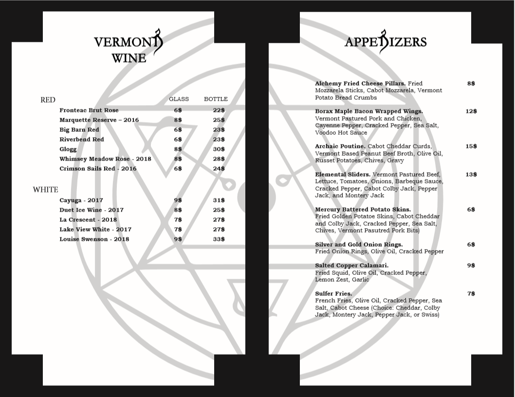
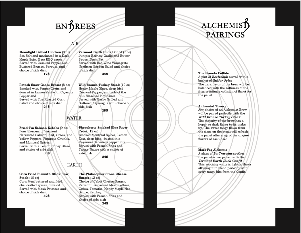
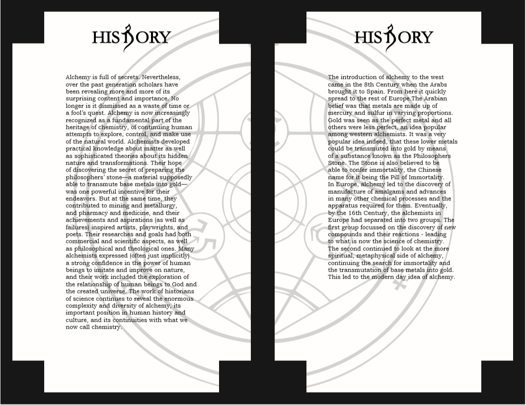
This is a mockup of the menu utilizing nationwide recognized state recipes, alchemical names, and alchemical history/research.
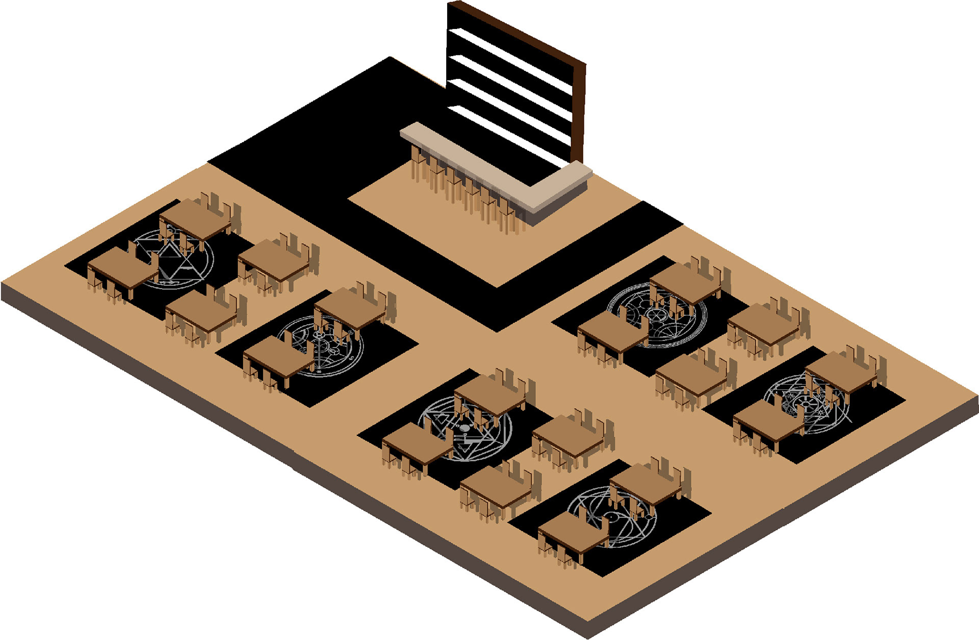
I chose to teach myself how to draw isometric grid illustrations in adobe illustrator. this allowed me the chance to broaden the presentation for "From the Earth" by designing a graphic interior of the dining room inside the restaurant.